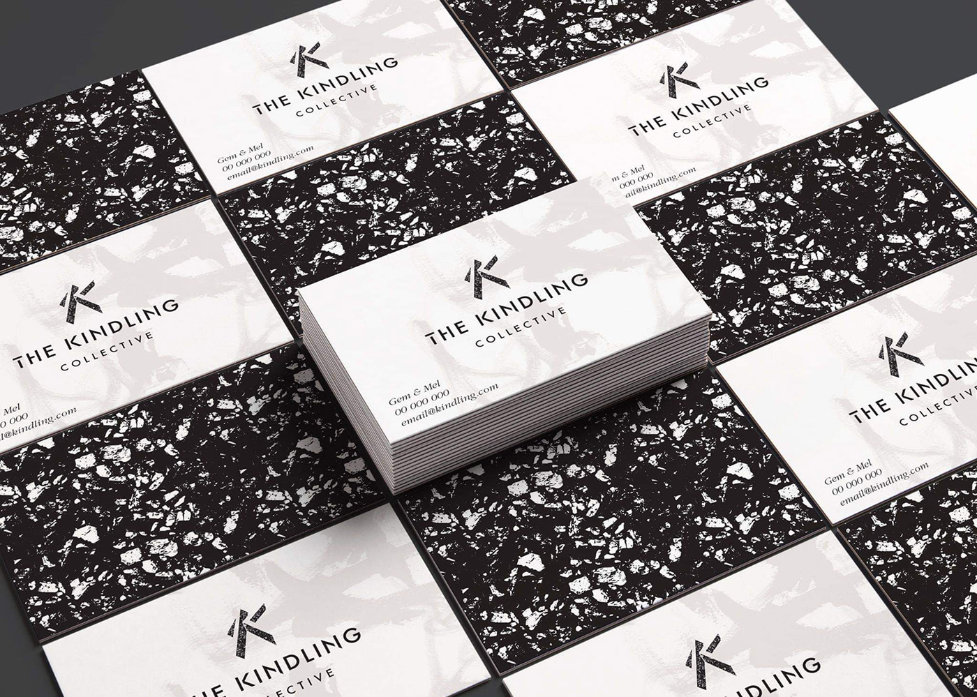
A London based theatre company.
The logotype pushes collaboration, freedom, contemporary to the forefront and encapsulates the name and idea of many parts coming together to create a “fire”
or in this instance, a word.
It produces a visceral experience of reading the words before realising its a collection of unique strokes broken up.
The Brandmark includes sampled images of burnt wood and charcoal that fill the shape. The charcoal gives the mark a textured, honest tone and conveys not only the concept of kindling and igniting a flame but that of regeneration and new life.
The use of the raw fill balances the cleanliness and sharpness of
the contemporary Logotype.
B1 The foundation of the Brandmark is that of a very modern monogram depicting
“T”, “C” and a large emphasis on “K”.
B2 It resembles a triangle in its entirety echoing the imagery of different bits of kindling leaning against one another to create an environment fitting to start a fire.
B3 The two separate triangles convey motion, presenting two disciplines
or directions coming together to create an image or creative outcome.
The shapes themselves aren’t there but the shadows that they have cast are. This helps the Logomark raise from the canvas. It has depth and complexity in its simplicity.
The free brush strokes show movement and freedom.